Components
Carousel
A slideshow component for cycling through elements—images or slides of text—like a carousel.
View page source on GitHubOn this page
How it works#
- The carousel is a slideshow for cycling through a series of content, built with CSS transforms and Bootstrap's JavaScript. It works with a series of images, text, or custom markup. It also includes support for previous/next controls and indicators.
- For performance reasons, carousels must be manually initialized using the carousel constructor method. Without initialization, some of the event listeners (specifically, the events needed for touch/swipe support) will not be registered until a user has explicitly activated a control or indicator. The only exception are autoplaying carousels with the
data-bs-ride="carousel"attribute, which are initialized automatically on page load. Don't initialize those again with the constructor. - Nested carousels are not supported. You should also be aware that carousels in general can often cause usability and accessibility challenges.
- The slides move with a transition that felt-css turns off for visitors who ask for reduced motion (
prefers-reduced-motion: reduce), like Bootstrap does.
Basic examples#
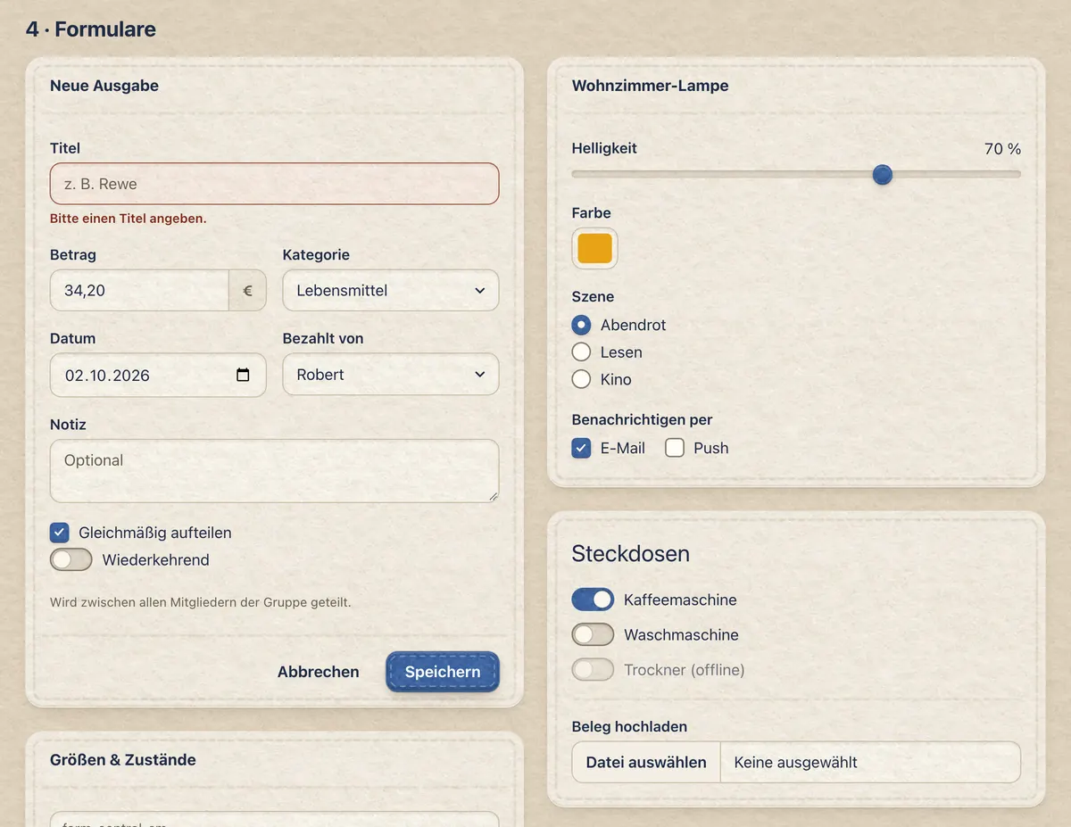
Here is a basic example of a carousel with three slides. Note the previous/next controls. We recommend using <button> elements, but you can also use <a> elements with role="button".


<div id="carouselExample" class="carousel slide">
  <div class="carousel-inner">
    <div class="carousel-item active">
      <div class="ratio ratio-21x9"><img src="../../../docs/sample-photo.webp" class="object-fit-cover" alt="A felt sun on a sunny windowsill"></div>
    </div>
    <div class="carousel-item">
      <div class="ratio ratio-21x9"><img src="../../../docs/banner.webp" class="object-fit-cover" alt="felt-css in blue felt letters, with patches around"></div>
    </div>
    <div class="carousel-item">
      <div class="ratio ratio-21x9"><img src="../../../docs/felt.webp" class="object-fit-cover" alt="Forms in the felt look"></div>
    </div>
  </div>
  <button class="carousel-control-prev" type="button" data-bs-target="#carouselExample" data-bs-slide="prev">
    <span class="carousel-control-prev-icon" aria-hidden="true"></span>
    <span class="visually-hidden">Previous</span>
  </button>
  <button class="carousel-control-next" type="button" data-bs-target="#carouselExample" data-bs-slide="next">
    <span class="carousel-control-next-icon" aria-hidden="true"></span>
    <span class="visually-hidden">Next</span>
  </button>
</div>
Carousels don't automatically normalize slide dimensions. As such, you may need to use additional utilities or custom styles to appropriately size content; the examples here put each image in a .ratio and crop it with .object-fit-cover. While carousels support previous/next controls and indicators, they're not explicitly required. Add and customize as you see fit.
You must add the .active class to one of the slides, otherwise the carousel will not be visible. Also be sure to set a unique id on the .carousel for optional controls, especially if you're using multiple carousels on a single page. Control and indicator elements must have a data-bs-target attribute (or href for links) that matches the id of the .carousel element. Keep the .slide class: Bootstrap's JavaScript only animates a carousel that has it.
In the felt look the slides are a photo lying on the felt, held by four little felt corners. The previous/next controls are small round patches of undyed wool, sewn on with a ring of stitches, and the indicators are a row of stitches across the photo; the current slide's is a patch. In dark mode, or with .carousel-dark, the patches are charcoal felt.
Indicators#
You can add indicators to the carousel, alongside the previous/next controls. The indicators let users jump directly to a particular slide.
<div id="carouselExampleIndicators" class="carousel slide">
  <div class="carousel-indicators">
    <button type="button" data-bs-target="#carouselExampleIndicators" data-bs-slide-to="0" class="active" aria-current="true" aria-label="Slide 1"></button>
    <button type="button" data-bs-target="#carouselExampleIndicators" data-bs-slide-to="1" aria-label="Slide 2"></button>
    <button type="button" data-bs-target="#carouselExampleIndicators" data-bs-slide-to="2" aria-label="Slide 3"></button>
  </div>
  <div class="carousel-inner">
    <div class="carousel-item active">
      <div class="ratio ratio-21x9"><img src="../../../docs/sample-photo.webp" class="object-fit-cover" alt="A felt sun on a sunny windowsill"></div>
    </div>
    <div class="carousel-item">
      <div class="ratio ratio-21x9"><img src="../../../docs/banner.webp" class="object-fit-cover" alt="felt-css in blue felt letters, with patches around"></div>
    </div>
    <div class="carousel-item">
      <div class="ratio ratio-21x9"><img src="../../../docs/felt.webp" class="object-fit-cover" alt="Forms in the felt look"></div>
    </div>
  </div>
  <button class="carousel-control-prev" type="button" data-bs-target="#carouselExampleIndicators" data-bs-slide="prev">
    <span class="carousel-control-prev-icon" aria-hidden="true"></span>
    <span class="visually-hidden">Previous</span>
  </button>
  <button class="carousel-control-next" type="button" data-bs-target="#carouselExampleIndicators" data-bs-slide="next">
    <span class="carousel-control-next-icon" aria-hidden="true"></span>
    <span class="visually-hidden">Next</span>
  </button>
</div>Captions#
You can add captions to your slides with the .carousel-caption element within any .carousel-item. They can be easily hidden on smaller viewports, as shown below, with optional display utilities. We hide them initially with .d-none and bring them back on medium-sized devices with .d-md-block.
First slide label
Some representative placeholder content for the first slide.
Second slide label
Some representative placeholder content for the second slide.
Third slide label
Some representative placeholder content for the third slide.
<div id="carouselExampleCaptions" class="carousel slide">
  <div class="carousel-indicators">
    <button type="button" data-bs-target="#carouselExampleCaptions" data-bs-slide-to="0" class="active" aria-current="true" aria-label="Slide 1"></button>
    <button type="button" data-bs-target="#carouselExampleCaptions" data-bs-slide-to="1" aria-label="Slide 2"></button>
    <button type="button" data-bs-target="#carouselExampleCaptions" data-bs-slide-to="2" aria-label="Slide 3"></button>
  </div>
  <div class="carousel-inner">
    <div class="carousel-item active">
      <div class="ratio ratio-21x9 bg-black"><img src="../../../docs/sample-photo.webp" class="object-fit-cover opacity-50" alt="A felt sun on a sunny windowsill"></div>
      <div class="carousel-caption d-none d-md-block text-white">
        <h5>First slide label</h5>
        <p>Some representative placeholder content for the first slide.</p>
      </div>
    </div>
    <div class="carousel-item">
      <div class="ratio ratio-21x9 bg-black"><img src="../../../docs/banner.webp" class="object-fit-cover opacity-50" alt="felt-css in blue felt letters, with patches around"></div>
      <div class="carousel-caption d-none d-md-block text-white">
        <h5>Second slide label</h5>
        <p>Some representative placeholder content for the second slide.</p>
      </div>
    </div>
    <div class="carousel-item">
      <div class="ratio ratio-21x9 bg-black"><img src="../../../docs/felt.webp" class="object-fit-cover opacity-50" alt="Forms in the felt look"></div>
      <div class="carousel-caption d-none d-md-block text-white">
        <h5>Third slide label</h5>
        <p>Some representative placeholder content for the third slide.</p>
      </div>
    </div>
  </div>
  <button class="carousel-control-prev" type="button" data-bs-target="#carouselExampleCaptions" data-bs-slide="prev">
    <span class="carousel-control-prev-icon" aria-hidden="true"></span>
    <span class="visually-hidden">Previous</span>
  </button>
  <button class="carousel-control-next" type="button" data-bs-target="#carouselExampleCaptions" data-bs-slide="next">
    <span class="carousel-control-next-icon" aria-hidden="true"></span>
    <span class="visually-hidden">Next</span>
  </button>
</div>
Captions lie on the photo, so they need contrast with it. Here the photos are dimmed (an .opacity-50 image on .bg-black) and the captions stay white with .text-white; by default they follow --felt-carousel-caption-color, which turns black in dark mode, like Bootstrap's.
Crossfade#
Add .carousel-fade to your carousel to animate slides with a fade transition instead of a slide. Depending on your carousel content (e.g., text only slides), you may want to add .bg-body or some custom CSS to the .carousel-items for proper crossfading.
<div id="carouselExampleFade" class="carousel slide carousel-fade">
  <div class="carousel-inner">
    <div class="carousel-item active">
      <div class="ratio ratio-21x9"><img src="../../../docs/sample-photo.webp" class="object-fit-cover" alt="A felt sun on a sunny windowsill"></div>
    </div>
    <div class="carousel-item">
      <div class="ratio ratio-21x9"><img src="../../../docs/banner.webp" class="object-fit-cover" alt="felt-css in blue felt letters, with patches around"></div>
    </div>
    <div class="carousel-item">
      <div class="ratio ratio-21x9"><img src="../../../docs/felt.webp" class="object-fit-cover" alt="Forms in the felt look"></div>
    </div>
  </div>
  <button class="carousel-control-prev" type="button" data-bs-target="#carouselExampleFade" data-bs-slide="prev">
    <span class="carousel-control-prev-icon" aria-hidden="true"></span>
    <span class="visually-hidden">Previous</span>
  </button>
  <button class="carousel-control-next" type="button" data-bs-target="#carouselExampleFade" data-bs-slide="next">
    <span class="carousel-control-next-icon" aria-hidden="true"></span>
    <span class="visually-hidden">Next</span>
  </button>
</div>
Autoplaying carousels#
You can make your carousels autoplay on page load by setting the ride option to carousel. Autoplaying carousels automatically pause while hovered with the mouse. This behavior can be controlled with the pause option. In browsers that support the Page Visibility API, the carousel will stop cycling when the webpage is not visible to the user (such as when the browser tab is inactive, or when the browser window is minimized).
For accessibility reasons, we recommend avoiding the use of autoplaying carousels. If your page does include an autoplaying carousel, we recommend providing an additional button or control to explicitly pause/stop the carousel. See WCAG 2.2 Success Criterion 2.2.2 Pause, Stop, Hide.
<div id="carouselExampleAutoplaying" class="carousel slide" data-bs-ride="carousel">
  <div class="carousel-inner">
    <div class="carousel-item active">
      <div class="ratio ratio-21x9"><img src="../../../docs/sample-photo.webp" class="object-fit-cover" alt="A felt sun on a sunny windowsill"></div>
    </div>
    <div class="carousel-item">
      <div class="ratio ratio-21x9"><img src="../../../docs/banner.webp" class="object-fit-cover" alt="felt-css in blue felt letters, with patches around"></div>
    </div>
    <div class="carousel-item">
      <div class="ratio ratio-21x9"><img src="../../../docs/felt.webp" class="object-fit-cover" alt="Forms in the felt look"></div>
    </div>
  </div>
  <button class="carousel-control-prev" type="button" data-bs-target="#carouselExampleAutoplaying" data-bs-slide="prev">
    <span class="carousel-control-prev-icon" aria-hidden="true"></span>
    <span class="visually-hidden">Previous</span>
  </button>
  <button class="carousel-control-next" type="button" data-bs-target="#carouselExampleAutoplaying" data-bs-slide="next">
    <span class="carousel-control-next-icon" aria-hidden="true"></span>
    <span class="visually-hidden">Next</span>
  </button>
</div>
When the ride option is set to true, rather than carousel, the carousel won't automatically start to cycle on page load. Instead, it will only start after the first user interaction.
<div id="carouselExampleRide" class="carousel slide" data-bs-ride="true">
  <div class="carousel-inner">
    <div class="carousel-item active">
      <div class="ratio ratio-21x9"><img src="../../../docs/sample-photo.webp" class="object-fit-cover" alt="A felt sun on a sunny windowsill"></div>
    </div>
    <div class="carousel-item">
      <div class="ratio ratio-21x9"><img src="../../../docs/banner.webp" class="object-fit-cover" alt="felt-css in blue felt letters, with patches around"></div>
    </div>
    <div class="carousel-item">
      <div class="ratio ratio-21x9"><img src="../../../docs/felt.webp" class="object-fit-cover" alt="Forms in the felt look"></div>
    </div>
  </div>
  <button class="carousel-control-prev" type="button" data-bs-target="#carouselExampleRide" data-bs-slide="prev">
    <span class="carousel-control-prev-icon" aria-hidden="true"></span>
    <span class="visually-hidden">Previous</span>
  </button>
  <button class="carousel-control-next" type="button" data-bs-target="#carouselExampleRide" data-bs-slide="next">
    <span class="carousel-control-next-icon" aria-hidden="true"></span>
    <span class="visually-hidden">Next</span>
  </button>
</div>
Individual .carousel-item interval#
Add data-bs-interval="" to a .carousel-item to change the amount of time to delay between automatically cycling to the next item.
<div id="carouselExampleInterval" class="carousel slide" data-bs-ride="carousel">
  <div class="carousel-inner">
    <div class="carousel-item active" data-bs-interval="10000">
      <div class="ratio ratio-21x9"><img src="../../../docs/sample-photo.webp" class="object-fit-cover" alt="A felt sun on a sunny windowsill"></div>
    </div>
    <div class="carousel-item" data-bs-interval="2000">
      <div class="ratio ratio-21x9"><img src="../../../docs/banner.webp" class="object-fit-cover" alt="felt-css in blue felt letters, with patches around"></div>
    </div>
    <div class="carousel-item">
      <div class="ratio ratio-21x9"><img src="../../../docs/felt.webp" class="object-fit-cover" alt="Forms in the felt look"></div>
    </div>
  </div>
  <button class="carousel-control-prev" type="button" data-bs-target="#carouselExampleInterval" data-bs-slide="prev">
    <span class="carousel-control-prev-icon" aria-hidden="true"></span>
    <span class="visually-hidden">Previous</span>
  </button>
  <button class="carousel-control-next" type="button" data-bs-target="#carouselExampleInterval" data-bs-slide="next">
    <span class="carousel-control-next-icon" aria-hidden="true"></span>
    <span class="visually-hidden">Next</span>
  </button>
</div>
Autoplaying carousels without controls#
Here's a carousel with slides only. Note the presence of .d-block and .w-100 on carousel images when they aren't wrapped in a .ratio, to prevent browser default image alignment.
<div id="carouselExampleSlidesOnly" class="carousel slide" data-bs-ride="carousel">
  <div class="carousel-inner">
    <div class="carousel-item active">
      <div class="ratio ratio-21x9"><img src="../../../docs/sample-photo.webp" class="object-fit-cover" alt="A felt sun on a sunny windowsill"></div>
    </div>
    <div class="carousel-item">
      <div class="ratio ratio-21x9"><img src="../../../docs/banner.webp" class="object-fit-cover" alt="felt-css in blue felt letters, with patches around"></div>
    </div>
    <div class="carousel-item">
      <div class="ratio ratio-21x9"><img src="../../../docs/felt.webp" class="object-fit-cover" alt="Forms in the felt look"></div>
    </div>
  </div>
</div>
Disable touch swiping#
Carousels support swiping left/right on touchscreen devices to move between slides. This can be disabled by setting the touch option to false.
<div id="carouselExampleControlsNoTouching" class="carousel slide" data-bs-touch="false">
  <div class="carousel-inner">
    <div class="carousel-item active">
      <div class="ratio ratio-21x9"><img src="../../../docs/sample-photo.webp" class="object-fit-cover" alt="A felt sun on a sunny windowsill"></div>
    </div>
    <div class="carousel-item">
      <div class="ratio ratio-21x9"><img src="../../../docs/banner.webp" class="object-fit-cover" alt="felt-css in blue felt letters, with patches around"></div>
    </div>
    <div class="carousel-item">
      <div class="ratio ratio-21x9"><img src="../../../docs/felt.webp" class="object-fit-cover" alt="Forms in the felt look"></div>
    </div>
  </div>
  <button class="carousel-control-prev" type="button" data-bs-target="#carouselExampleControlsNoTouching" data-bs-slide="prev">
    <span class="carousel-control-prev-icon" aria-hidden="true"></span>
    <span class="visually-hidden">Previous</span>
  </button>
  <button class="carousel-control-next" type="button" data-bs-target="#carouselExampleControlsNoTouching" data-bs-slide="next">
    <span class="carousel-control-next-icon" aria-hidden="true"></span>
    <span class="visually-hidden">Next</span>
  </button>
</div>
Dark variant#
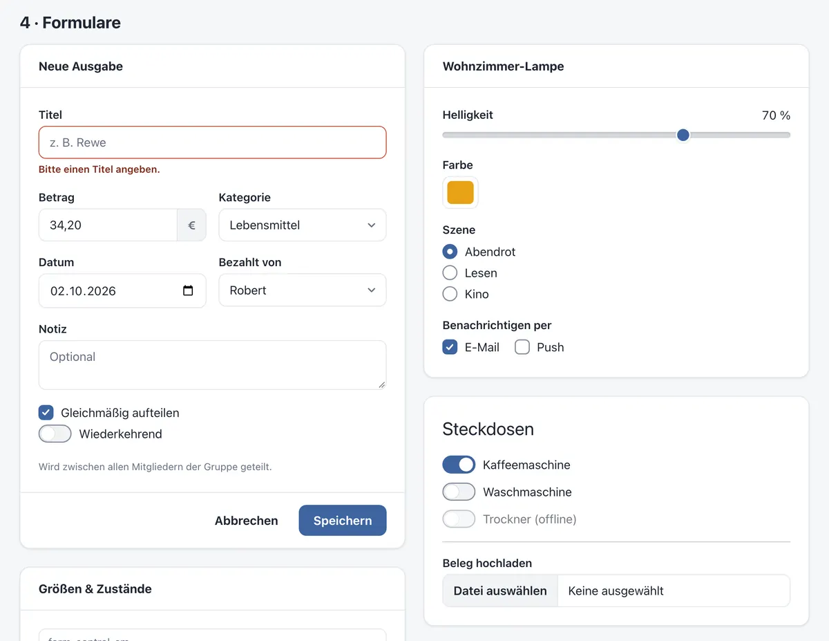
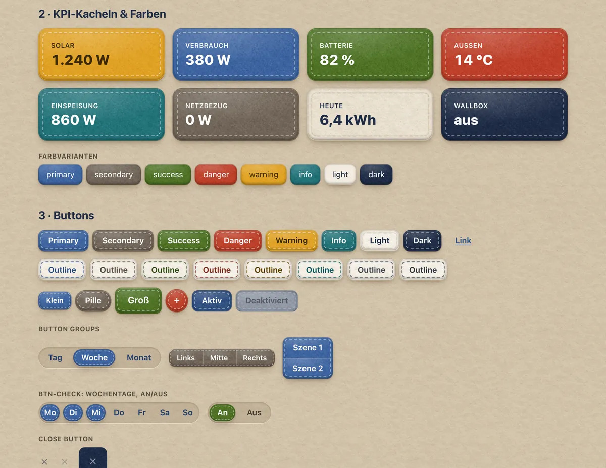
Add .carousel-dark to the .carousel for darker controls, indicators, and captions, for slides with light content. Bootstrap deprecated the class in 5.3 in favour of data-bs-theme="dark" on the .carousel, which works in felt-css too, but darkens everything inside the carousel along with them.
First slide label
Some representative placeholder content for the first slide.
Second slide label
Some representative placeholder content for the second slide.
Third slide label
Some representative placeholder content for the third slide.
<div id="carouselExampleDark" class="carousel carousel-dark slide">
  <div class="carousel-indicators">
    <button type="button" data-bs-target="#carouselExampleDark" data-bs-slide-to="0" class="active" aria-current="true" aria-label="Slide 1"></button>
    <button type="button" data-bs-target="#carouselExampleDark" data-bs-slide-to="1" aria-label="Slide 2"></button>
    <button type="button" data-bs-target="#carouselExampleDark" data-bs-slide-to="2" aria-label="Slide 3"></button>
  </div>
  <div class="carousel-inner">
    <div class="carousel-item active" data-bs-interval="10000">
      <div class="ratio ratio-21x9"><img src="../../../docs/clean.webp" class="object-fit-cover" alt="A page in the clean look"></div>
      <div class="carousel-caption d-none d-md-block">
        <h5>First slide label</h5>
        <p>Some representative placeholder content for the first slide.</p>
      </div>
    </div>
    <div class="carousel-item" data-bs-interval="2000">
      <div class="ratio ratio-21x9"><img src="../../../docs/felt.webp" class="object-fit-cover" alt="Forms in the felt look"></div>
      <div class="carousel-caption d-none d-md-block">
        <h5>Second slide label</h5>
        <p>Some representative placeholder content for the second slide.</p>
      </div>
    </div>
    <div class="carousel-item">
      <div class="ratio ratio-21x9"><img src="../../../docs/buttons.webp" class="object-fit-cover" alt="Buttons and tiles in the felt look"></div>
      <div class="carousel-caption d-none d-md-block">
        <h5>Third slide label</h5>
        <p>Some representative placeholder content for the third slide.</p>
      </div>
    </div>
  </div>
  <button class="carousel-control-prev" type="button" data-bs-target="#carouselExampleDark" data-bs-slide="prev">
    <span class="carousel-control-prev-icon" aria-hidden="true"></span>
    <span class="visually-hidden">Previous</span>
  </button>
  <button class="carousel-control-next" type="button" data-bs-target="#carouselExampleDark" data-bs-slide="next">
    <span class="carousel-control-next-icon" aria-hidden="true"></span>
    <span class="visually-hidden">Next</span>
  </button>
</div>
Like Bootstrap's, the controls, indicators and captions also turn dark in dark mode: they follow the colour mode of the page (or of data-bs-theme on the carousel).
Custom transition#
The transition duration of .carousel-item can be changed with custom styles; Bootstrap's JavaScript waits for whatever duration the CSS sets. If multiple transitions are applied, make sure the transform transition is defined first (e.g. transition: transform 2s ease, opacity .5s ease-out).
.carousel-item {
  transition-duration: 1.2s;
}CSS#
Variables#
The carousel declares these on .carousel; .carousel-dark sets them to black. Bootstrap draws white icons and darkens them with --bs-carousel-control-icon-filter in dark mode; felt-css draws the icons in --felt-carousel-indicator-active-bg instead, so the filter is none and free for your own use.
| Token | Default | Bootstrap |
|---|---|---|
--felt-carousel-indicator-active-bg | light-dark(#fff, #000) | --bs-carousel-indicator-active-bg |
--felt-carousel-caption-color | light-dark(#fff, #000) | --bs-carousel-caption-color |
--felt-carousel-control-icon-filter | none | --bs-carousel-control-icon-filter |
In the felt look the same variables colour the felt: --felt-carousel-indicator-active-bg is the colour of the control patches, the stitches and the current slide's patch (undyed wool, or charcoal felt in dark mode and with .carousel-dark), and --felt-carousel-caption-color the captions' ink.
Usage#
Via data attributes#
Use data attributes to easily control the position of the carousel. data-bs-slide accepts the keywords prev or next, which alters the slide position relative to its current position. Alternatively, use data-bs-slide-to to pass a raw slide index to the carousel data-bs-slide-to="2", which shifts the slide position to a particular index beginning with 0.
Via JavaScript#
felt-css is CSS only; the sliding comes from Bootstrap's carousel plugin. Call it manually with:
const carousel = new bootstrap.Carousel('#myCarousel', {
  interval: 2000,
  touch: false
})
Options (interval, keyboard, pause, ride, touch, wrap), methods (cycle, pause, prev, next, nextWhenVisible, to, dispose, getInstance, getOrCreateInstance) and events (slide.bs.carousel, slid.bs.carousel) work exactly as described in Bootstrap's carousel documentation.